5. Compute and read the map
Press Compute coverage. Then, before you believe any of it, read this page.
A heatmap is very persuasive. It is worth a few minutes learning what each one actually says, because they answer different questions and the prettiest one is not the most useful.
The layers
Switch between these in the sidebar. They are computed from the same solve, so switching is instant.
Signal strength (dBm)
How much power arrives, from whichever access point is strongest at that point.
This is the number every phone shows you, which is why people reach for it first. It is also the least useful of the five on its own, because a strong signal on a channel your neighbour is hammering is worse than a weaker signal on a quiet one.
The bands the app uses:
| Level | Meaning |
|---|---|
| better than −45 dBm | excellent, you are close to the router |
| −45 to −55 dBm | very good |
| −55 to −67 dBm | reliable data |
| −67 to −70 dBm | the usual floor for voice calls |
| −70 to −80 dBm | works, slowly, and drops under load |
| worse than −85 dBm | no usable link |
The classic planning threshold is −67 dBm, which is where voice over Wi-Fi stops being reliable. If you only remember one number, remember that one.
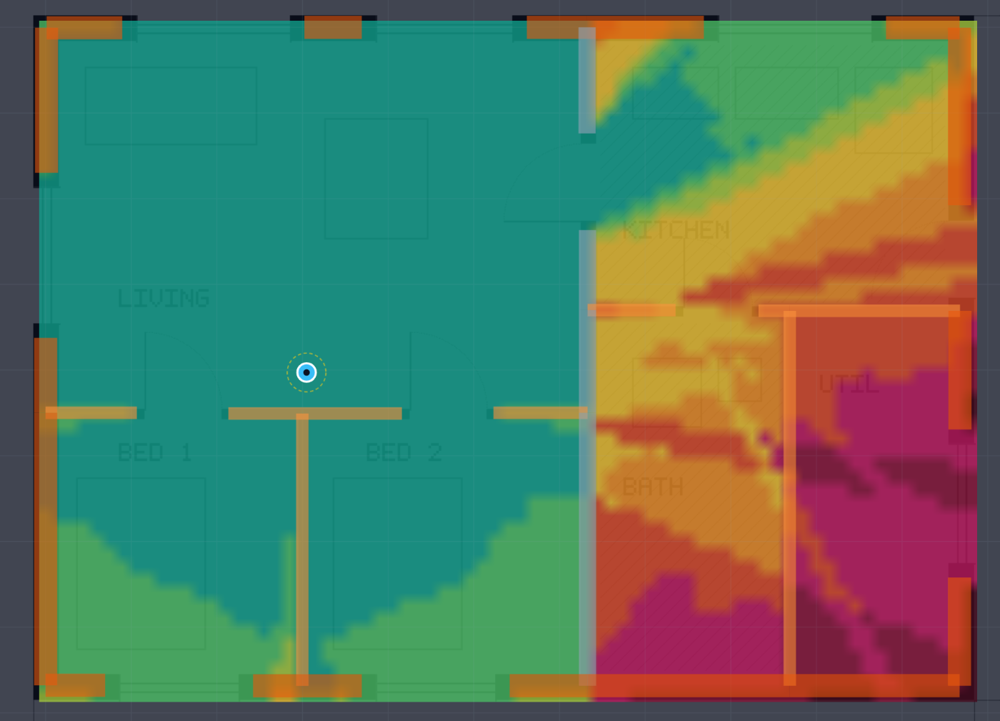
One router in the living room of the example flat. Notice three things: the stud partitions between the bedrooms barely register, the load-bearing wall in the middle is a cliff, and the one strong path into the kitchen runs through the door opening rather than through the wall beside it.
SINR (dB)
Signal divided by noise plus interference. This is signal strength with the context added: how far above the racket the signal actually stands.
Compare the two maps. Where SINR is much worse than signal strength would suggest, you have an interference problem, not a coverage problem, and moving the router will not fix it. Changing channel might.
MCS
Which modulation the link can sustain. It is the direct translation of SINR into "how densely can we pack bits", from BPSK at the bottom to 1024-QAM at the top.
Useful when you want to see cliff edges. Modulation steps are discrete, so this map shows you exactly where a small loss of signal costs you a whole rate step.
PHY rate (Mb/s)
The raw over-the-air rate for the modulation, bandwidth and number of spatial streams available at that point.
This is the number router boxes advertise. It is not a speed you will ever measure, because it counts the preamble, the interframe spacing and the acknowledgement as though they were payload.
Throughput (Mb/s)
This is usually the map you want
It answers the question you actually have, which is whether things will work.
Actual payload throughput, after the protocol overhead is paid: preamble, interframe spaces, average backoff and the block acknowledgement, once per aggregate. It typically lands around 60 to 70 percent of the PHY rate.
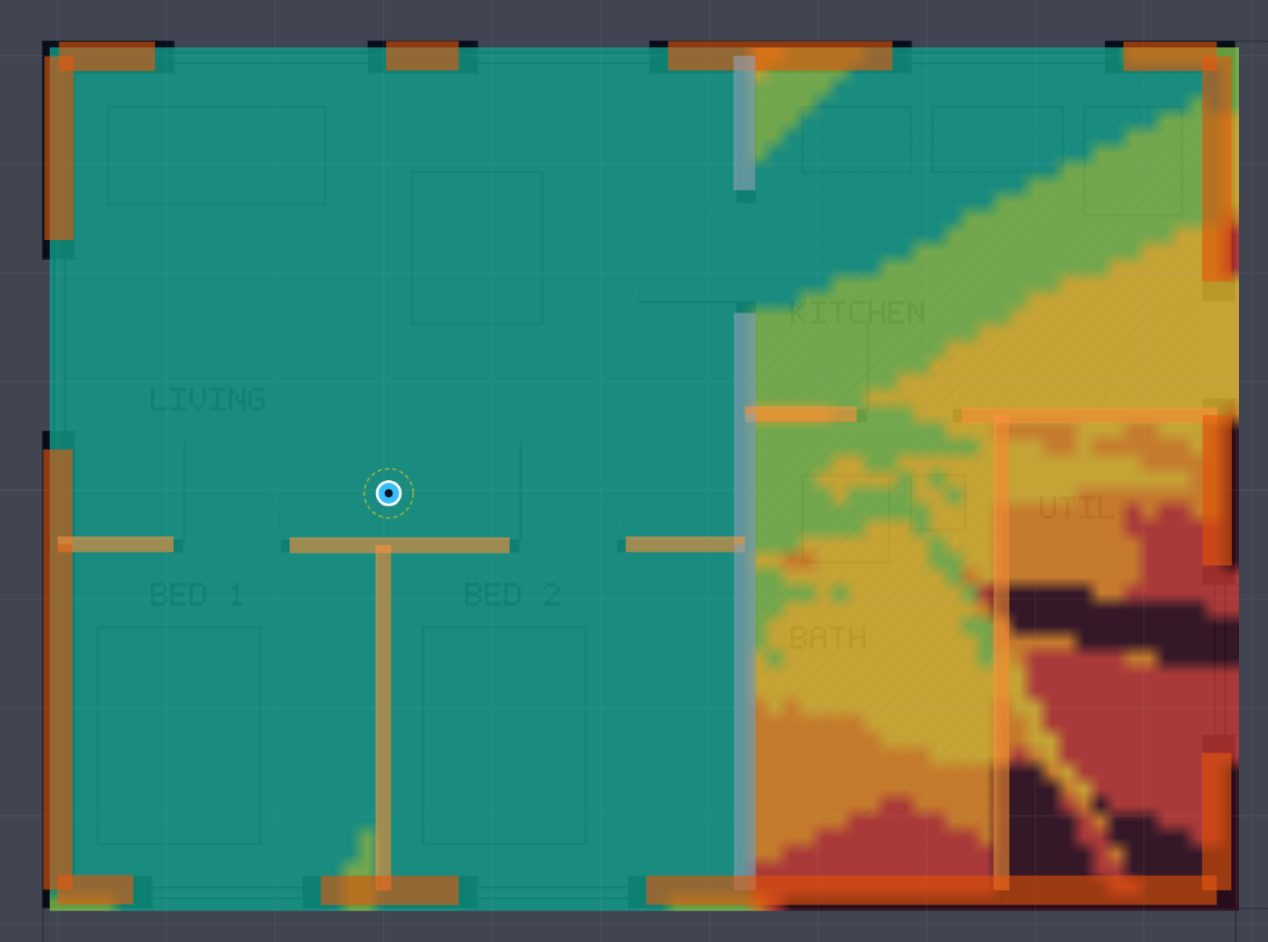
The same solve read as throughput. Dark means no link at all. Compare it with the signal strength map above: the living room is uniformly fine on both, but the far corner of the utility room turns out to have no usable link rather than a weak one.
One important caveat: this is a single station on an idle channel. It does not model several clients sharing airtime, OFDMA scheduling or multi-user MIMO. Treat it as the ceiling one device can reach, not as what you get with the whole family streaming.
Best access point
Which access point serves each point. Only interesting with more than one, where it shows you the handover boundaries and whether the cells overlap sensibly.
Coherent or incoherent
A setting worth understanding, in the solve options.
Incoherent is the default and adds the paths as powers. This gives you the local average, which is what a moving client experiences and what you want for a planning map.
Coherent adds the paths as complex fields, phase included. This shows the real standing wave pattern, with nulls and peaks every half wavelength. It is physically the more complete answer and it makes an alarming picture, full of speckle, because at 5 GHz a half wavelength is about 27 mm.
Use coherent when you want to see that the fine structure exists. Use incoherent to make decisions.
Probing a point
Click anywhere on the map. This is the single most useful feature in the app and most people never press it.
You get the individual ray paths drawn on the plan, and for each one: how long it is, what it went through, what it bounced off, at what angle, and how much each contributes.
This turns "the bedroom is bad" into an actual explanation. You will see things like:
- The direct path is gone and everything arriving is a ceiling bounce.
- Two thirds of the signal is coming through a door opening rather than through the wall, so the answer is where the door is, not where the router is.
- The strongest path goes through a window twice, out and back in, which means the coating on that window is now the deciding factor.
Sanity checks before you act on a map
Where the map looks surprisingly good, look for a missing wall. This is the most common failure and it always fails optimistically. Go back to the traced walls and check that room's outline is closed.
Where the map looks surprisingly bad, check the wall type. A partition that got matched to a 400 mm exterior wall will kill a room.
Compare against one real measurement. Stand somewhere with a Wi-Fi analyser, note the dBm, and compare with the same point on the map. If you are within a few decibels, trust the map. If you are 15 dB out, something in the model is wrong and the probe tool will usually show you what.
Check whether anything was extrapolated. If the model used a material outside the frequency range its data was published for, the app says so. That is a warning about a specific number, not about the whole map, but it tells you where to be careful.
Next
Going further: neighbours, channel plans, the optimiser and the report.